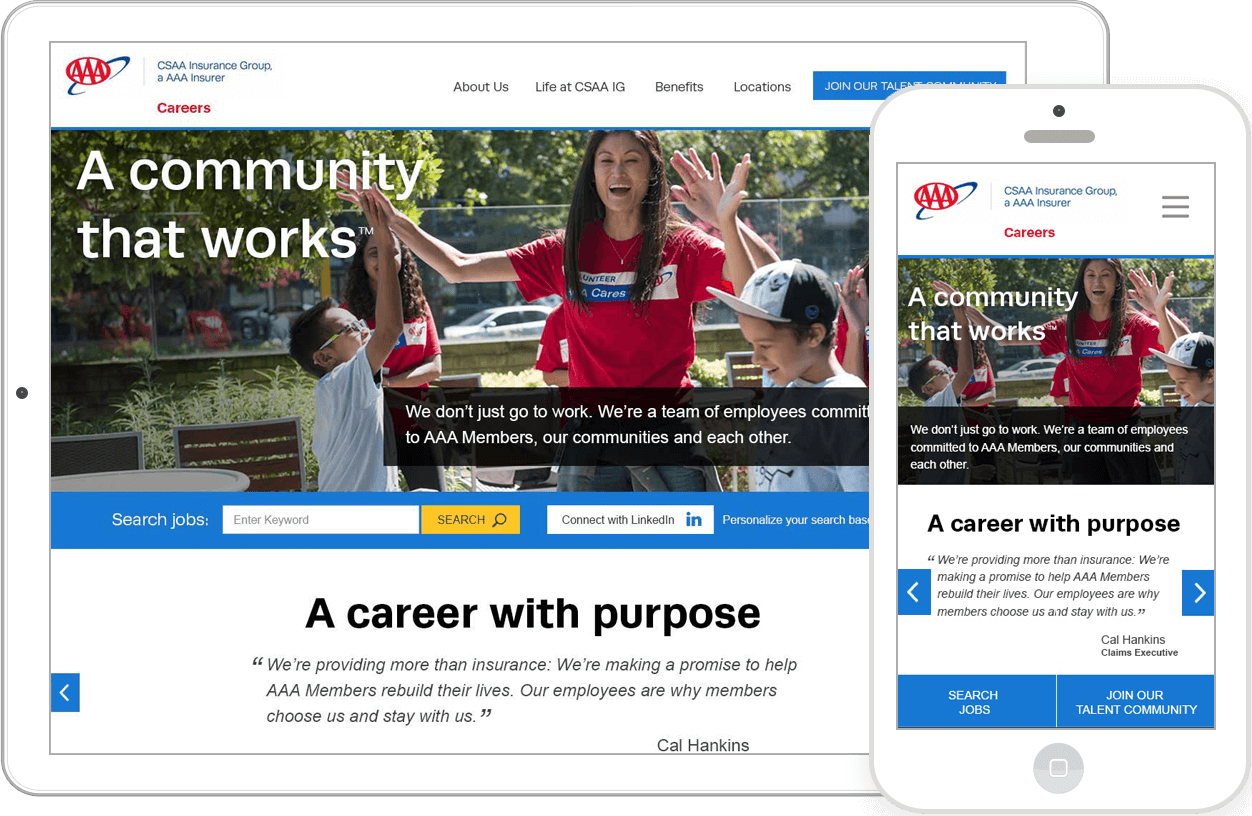
Rapid Design for AAA/CSAA Insurance Group's Careers Site
The Challenge
The current site was dated and didn’t have key features that today’s current employment seekers are accustomed to. . Tasked with the creation of a modern, world class careers site that would leave job seekers with impressions worthy of a national company, I had 3 weeks to design and have deliverables to developers.
My Role
- Information Architecture
- Visual Design
- UX/UI Consulting
- Development Management
The Solution
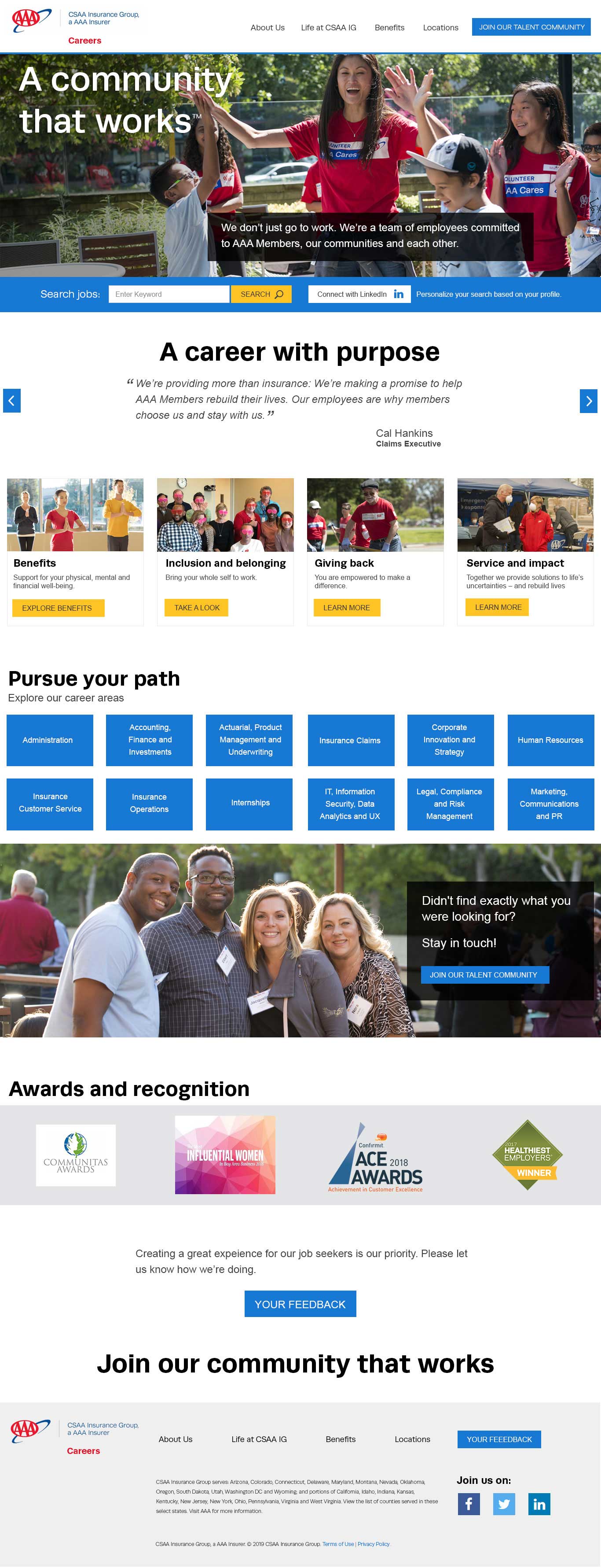
Rapid information architecture, UX/UI design, and Visual design to build a Career site that relays s a clear message of community and inclusion, conveying AAA/CSAA Insurance Group’s culture. Hand designs are sent off to a 3rd party career site specialist for development.
Develop Site Architecture and Establishing Must Haves for Launch
Day one,I got together with the HR team to explore what content must be on the site for launch, how it should be organized, and how the design could best accommodate it. I started with a whiteboard session to establish site architecture, then moved to Trello to keep team collaboration open.
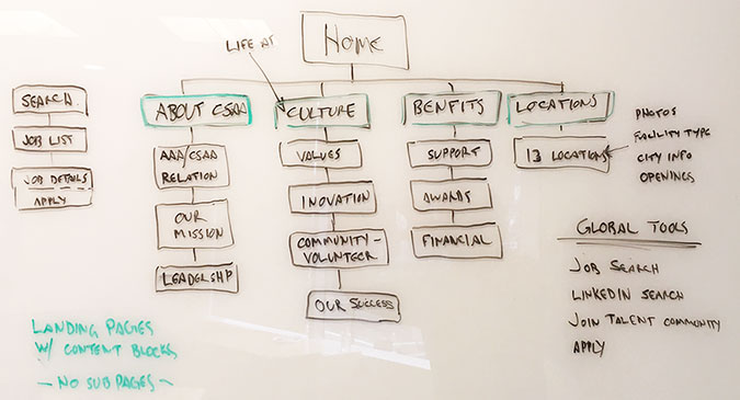
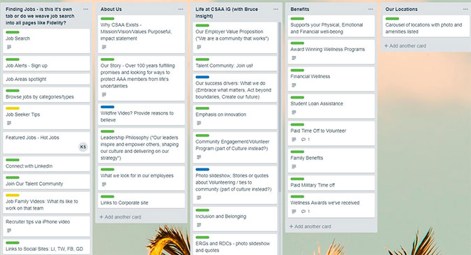
We determined using landing pages, with 5 to 7 precise content blocks, was the best and clearest way to convey messaging with users. The ultimate goal was for job seekers to be able to learn about the company, its culture and benefits by simply scanning a few pages. We aimed for succinct content with descriptive headlines to accomplish this.
Design Sketch and Wireframe
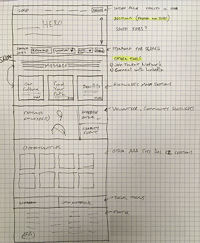
Integrating the information from the information architecture meeting, I quickly sketched up a rough wireframe of the homepage the took it back to the project manager for review. With a thumbs up, I took this initial sketch and moved on to visual design.
Visual Design Round One, Multiple options
Though on a tight schedule, I felt it was important to still explore multiple design possibilities for look and feel. With HR and Branding departpart expectations in mind, I developed two options. One aligned with current printed and marketing materials and the other was a more modern web look and feel. At the design review, the team felt it was time to evolve so the modern design was chosen.
Since some liberties were being taken with the current style guide, I scheduled a meeting with the Branding Department. We went over where new styles were being introduced and the value they add to the overall design. With just minor pushback to meet some national marketing requirements, the design was granted approval and I was able to move on.
Final Visual Design and Delivery to Development
After editing the design to accommodate feedback , I presented once more to the HR team and received approval to deliver to our 3rd party developers.
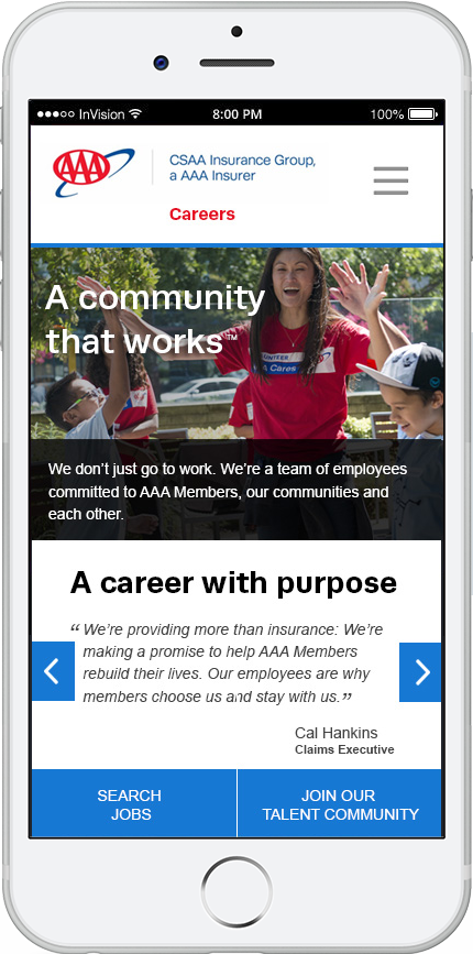
Before handing off the design, I ensured the files were pixel perfect. I created documentation outlining our behavioural expectations as well visual design displays for phones and tablets. I packaged these files with a new style guide and uploaded for our developers.
