Improving care team access: Helping members find providers and book care faster
Executive summary
Problem
Blue Shield of CA members struggled to locate their care team providers and schedule appointments within the member portal. This created frustration, increased support calls, and slowed access to care.
My role
I led the redesign of the provider contact and scheduling experience, consolidating fragmented provider information into a single workflow that allowed members to quickly identify their providers and book appointments.
Solution
The result was a simplified care-team experience that reduced friction in accessing care and improved self-service capabilities within the platform.
The initial ask
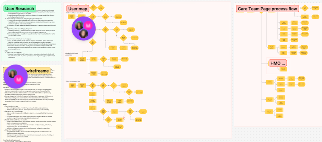
With some discovery done outside of the current UX team, product and business asked us to create a section called My Care Team that grouped all of the member's providers in one place. The initial proposal covered a lot of ground and included assumptions about the affordances we'd be using.
My team and I believed we could reduce scope, achieve the same goal, and simplify usability. So we went to work supplying data to support our direction.
Research — concept support
We first looked to gain support for this project.
| How likely are you to sign into your health insurance website for the following information? | Likely / Very Likely |
|---|---|
| Contact info for your PCP | 49% |
| Contact info for a dermatologist you have seen in the past | 50% |
| Contact info for your current mental health provider | 48% |
| Contact info for a specialist you have been referred to | 61% |
| Find a dermatologist near you | 70% |
| Book virtual care | 57% |
| Find an urgent care location | 63% |
Roughly half of the members we asked said they would look or have looked for provider info in the app or website.
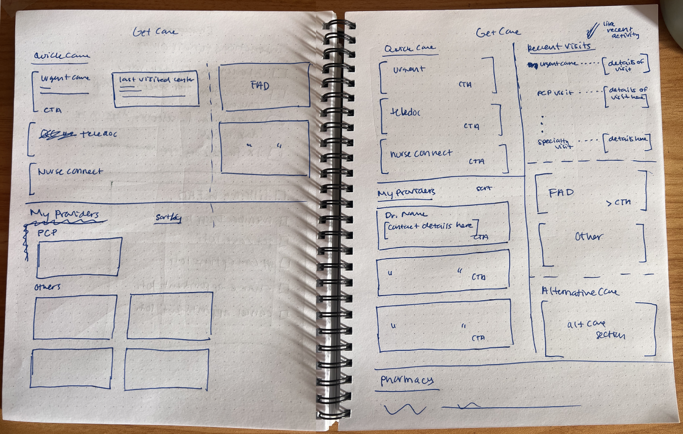
Ideation
After reviewing the process, we noted that there was already a "Get care" page (listing members' care options) that tested well. Could we utilize this page instead?
Research discoveries
We tested an inline version that listed a few current providers. Although it tested well for usability, specific feedback brought new discoveries:
Members wanted more than just current providers, with 39% wanting all doctors they had seen in the last 5 years, and 27% wanting all doctors they had ever seen.
If a member had more than a few providers, the page would not comfortably accommodate them. This research also brought content issues to light.
View providers CTA test
There was debate on the button text, with some believing that shorter is better. So we tested it. Adding the possessive "your" brought clarity for our members.
52% expect to see past or current providers
- All the providers I have used recently or in the past
- I would expect to see all of my providers (past and current)
- A list of my providers
Other
- a full list of healthcare providers available to me
- i can see the doctors who are in the network of my insurance
- More providers in the PCP’s office
- Doctors in the area where I live
78% expect to see past or current providers (up from 52%)
- The providers that I already have established visits with
- A list of all of the providers I have used within a selected period of time
- I expect to see a list of all the doctors that I've recently interacted with
The solution
I was on another project where fly-out drawers and bottom sheets were testing so well that we began integrating them into our design system.
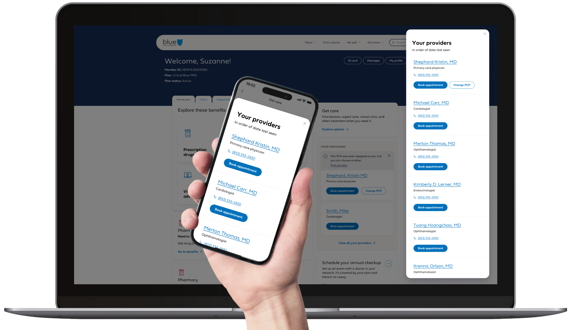
This was the perfect opportunity to bring in the same functionality. Members who saw several providers over time needed an easy way to access the complete list.
This solution lightened the cognitive load on the "Get care" page and also allowed us to surface an easy-access list directly on the member dashboard.
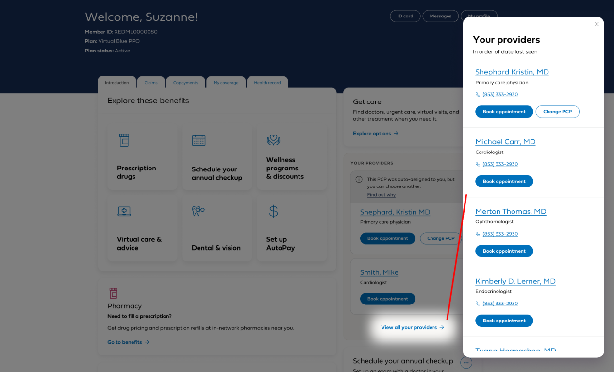
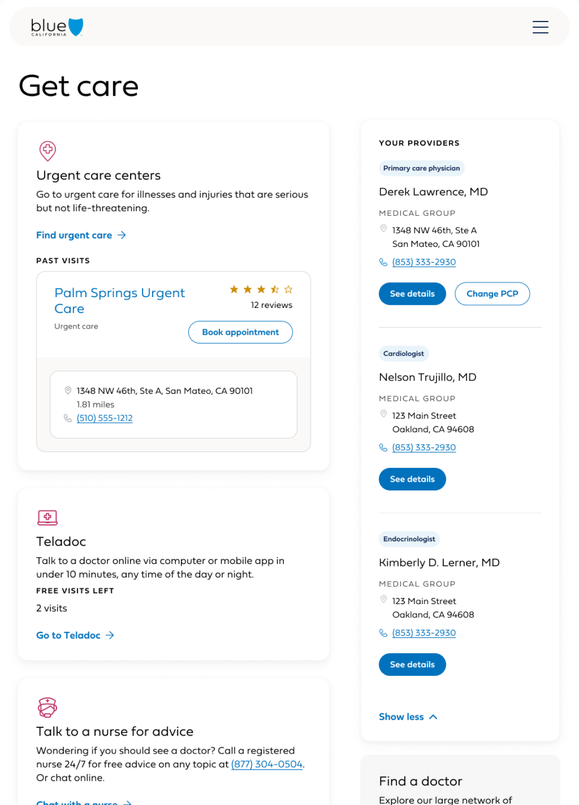
Solution summary
The final design introduced a care team module that consolidated provider information into a unified interface.
Key features included:
- A clear "My providers" overview available on the member dashboard and the get care page.
- Direct provider contact options
- Integrated "Book appointment" entry points
This reduced the number of steps required to connect with a provider and made care access more intuitive.
Impact
The redesigned experience simplified how members locate providers and schedule appointments.
Key improvements included:
- Faster provider discovery
- Reduced navigation complexity
- Clearer care team relationships
The solution established a scalable pattern for surfacing provider interactions across the member platform.
User feedback
~90% like having all current/past providers in one place, and also the options to find a new provider if needed.
- I like that I have the list in one place and can easily search for a new provider if necessary.
- I love that I can have access to a list of providers that I have seen in the past. It makes it so much more easier and convenient to find who I am looking for and need all under one place.
- My thoughts are that I can't imagine a better grouping of people, both those you know and trust and a list of new potential doctors? That's all I need.
- It is useful to have this available without searching for it
- I like both- I like having the option to quickly find them again but also would want the ability to look for new providers if I didn't really care for the provider I saw.
My work
Guided shopping: personalized plan recommendations
A conversational questionnaire and recommendations flow that helped prospects find the right health plan with confidence, scoring Best in Class against top competitors
Insurance knowledge center
Dashboard access to all resources in support of Service and Field Agents for policy creation and customer support covering all AAA product lines
Course gradebook
Gradebook with every feature demanded by teachers. Designed as a hub for course management and the central data entry tool for a full Learning Management System